
MAY I HAVE YOUR OPINION PLEASE?
Help me decide!
I often said that I prefer Aquabord™ to watercolor paper. One reason for this preference is that a varnished watercolor on Aquabord doesn’t require a mat or glass, just a frame like an oil painting.
But soon I realized that a mat contributes a lot to a watercolor painting. It offers a nice quiet surrounding area that sets off the central image.
I wondered how I could present a painting that has the advantage of a mat but does not require glass for protection. I came up with two possible solutions to this problem.
Can you help me by voting on which treatment below you think is the better one? To share your opinion, please click on this POLL.
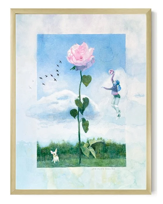
1. Add a “painted mat” to the surface.
Use pale washes of watercolor to paint a 1- to 2-inch-wide area that gives a matted effect. A thin frame completes the look.
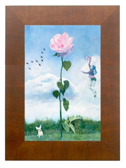
2. Use a wide (1-1/2 to 2 inches) frame to set off the painting.
This comes close to the effect of a matted work. If I decide to use this kind of frame, I’m afraid I will have to search high and low for just the right one!
NEW AND UPDATed WORK
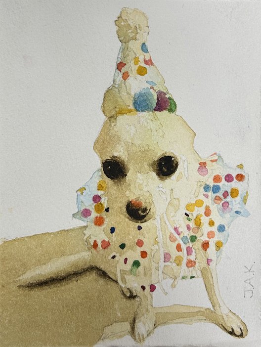
Lollie, 6x4.25 inches, watercolor
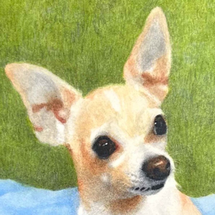
There’s nothing like an adorable chihuahua to make a lighthearted birthday card!
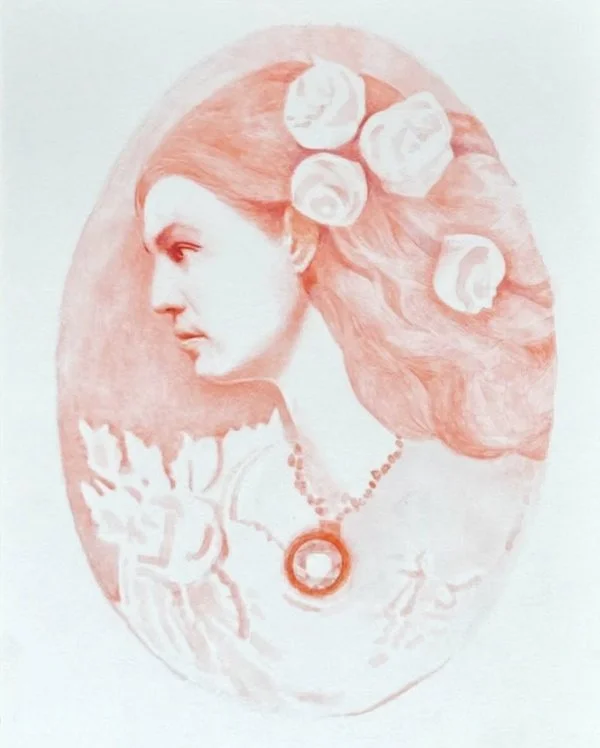
I have posted this cameo painting before in the form you see above. We had an assignment in the Ali Cavanaugh patreon to revisit an unfinished painting and add paint to it until we were satisfied. I added a frame and a watery blue background.
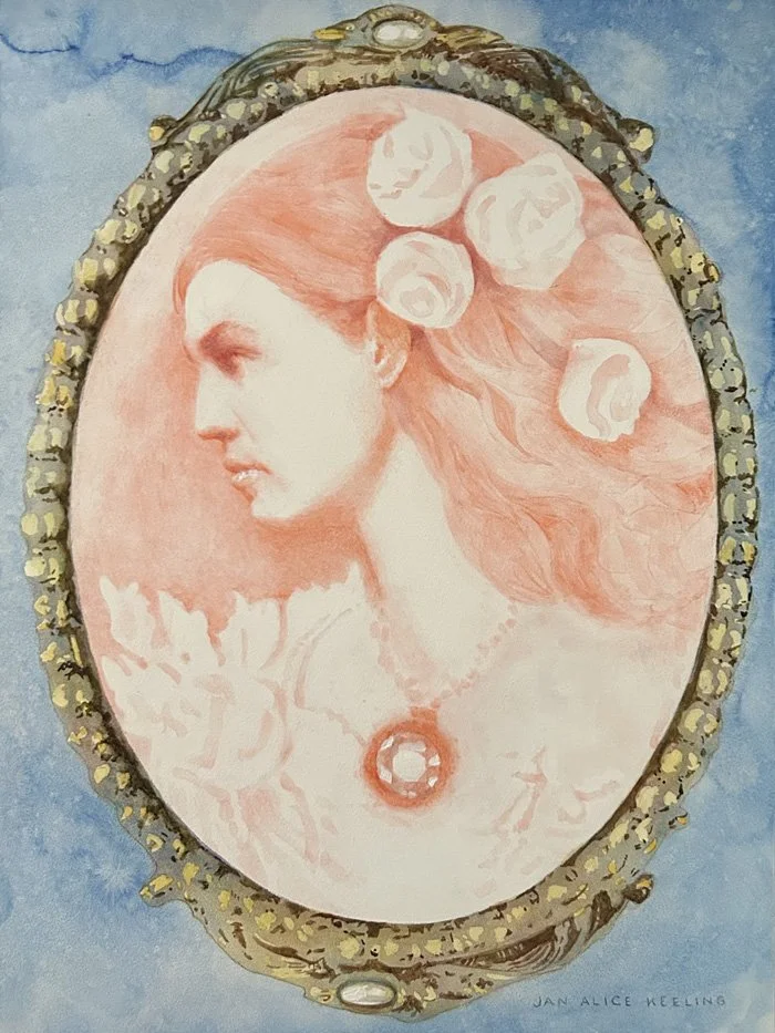
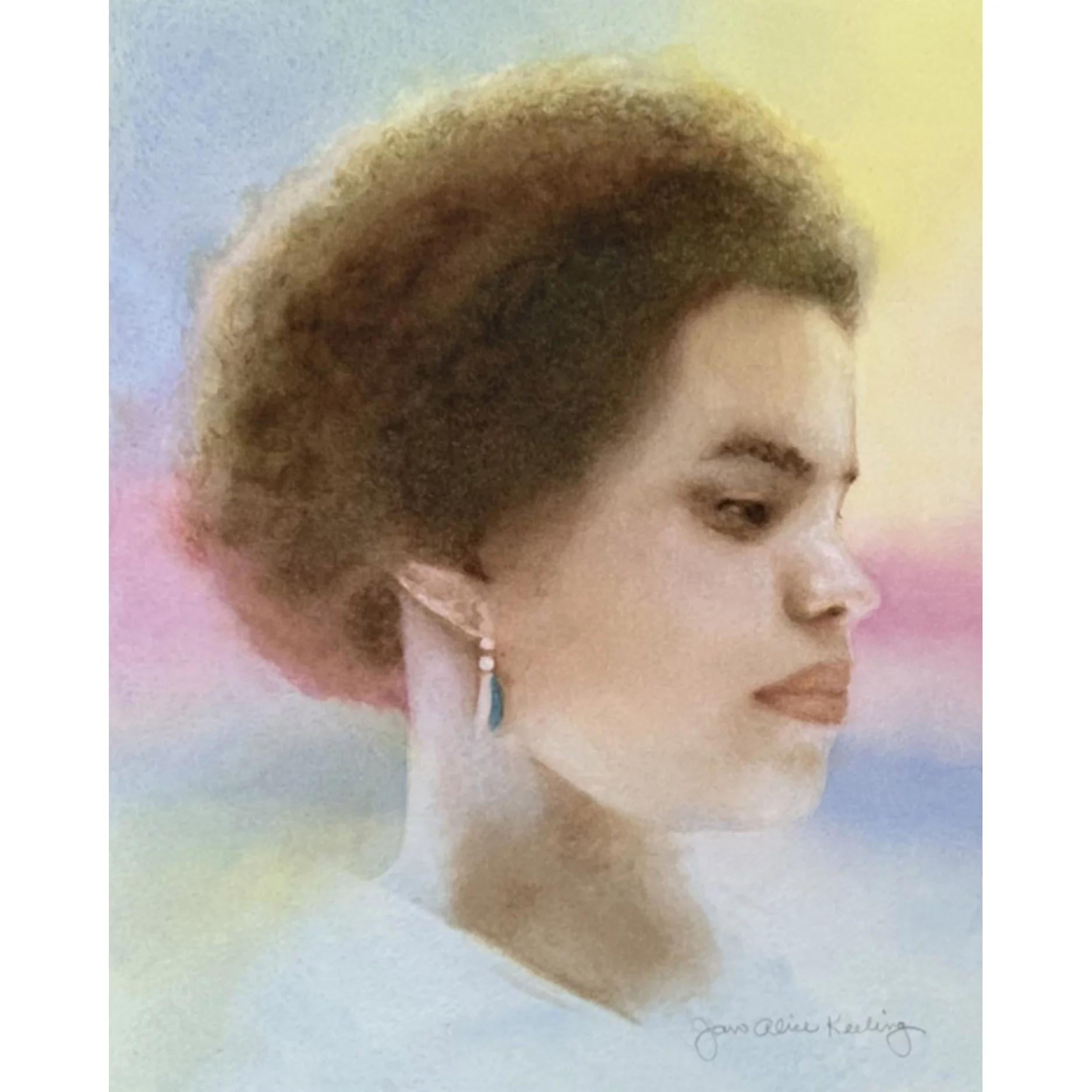
Cassie en Camée, 12×9 inches, watercolor on Aquabord
“Secret santa” portraits
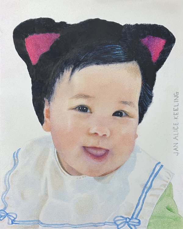
Kaia, 10×8 inches, watercolor on Aquabord
A LITTLE SWEETHEART
Ali Cavanaugh organizes a “Secret Santa” activity every December. Each participant submits three photographs of her/himself or of a loved one, and another artist in the group is randomly chosen to paint a portrait from one of the photos.
I received three adorable photos of Kaia from her grandmother, and I selected one that gave me a reference for this irresistible smile!
Everything is kept secret until time comes to unveil the portraits. So much fun! It was a pleasure to paint this little sweetheart.
SUSAN FRISBEE’S PORTRAIT OF ME
I wanted to see what it was like to be someone else’s muse for a change, so I submitted photographs of myself.
Susan Frisbee was assigned to paint me, and I am very pleased with what this talented artist did with the assignment. I have been told I look quite dignified in this portrait. I love it.
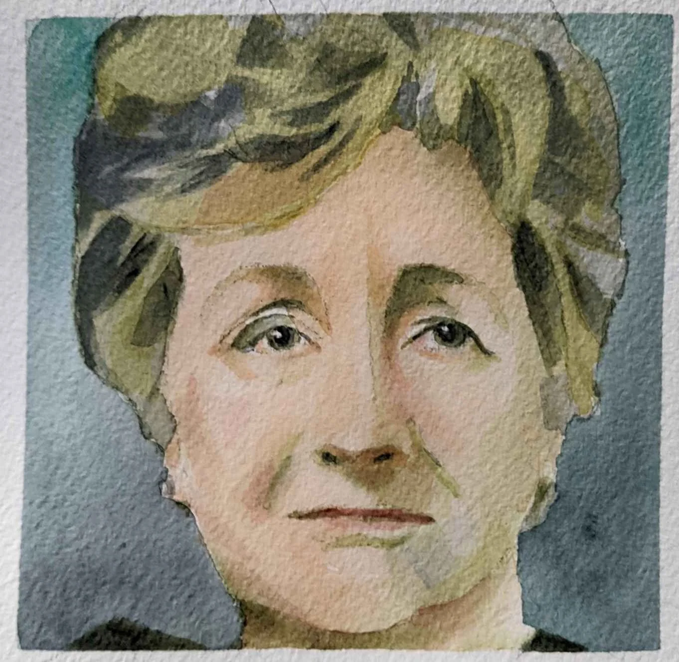
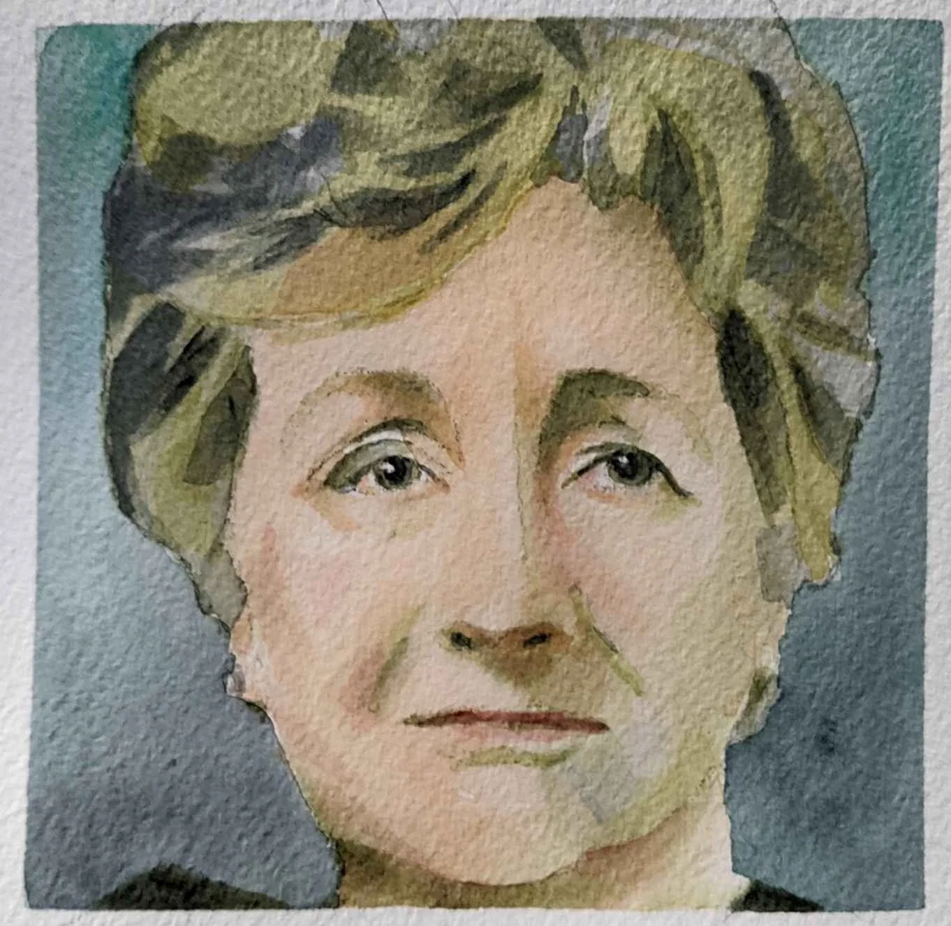
Jan Alice, watercolor by Susan Frisbee
IT'S TIME TO HAVE A SHOW
It will take about a year.
Just call me a late bloomer.
Sometimes people ask me why I’ve never had a solo show during my long career. I often reply, “I never have enough paintings in inventory for a show.” That has always been true, but even truer was my belief that I was not quite ready.
But now I have at long last “found my voice.” I know the kinds of paintings I want to create, and I think I have the skills to paint them.
It will take me a year to create enough works for a show. I won’t be posting these paintings on this blog as I paint them. I want these paintings to surprise! So I will not share them with the public until the show’s opening night.
NEW WORK

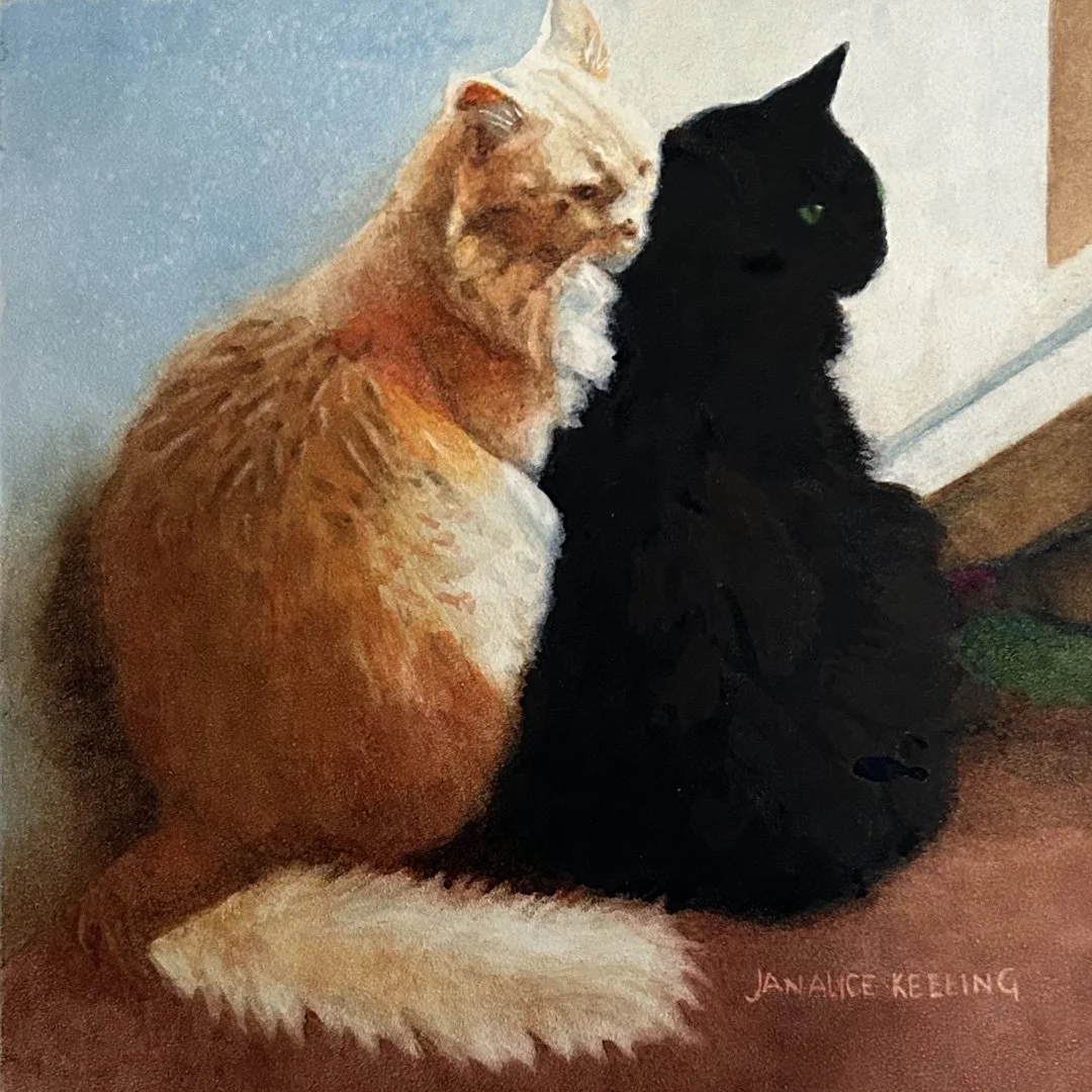
Alamo and Mingus, watercolor on Aquabord™, 8x8 inches
Alamo and Mingus is a small painting I presented as a wedding gift to my dear nephew and his lovely wife.
I asked the couple to tell me something about their cats: “These two balls of energy and fur are each other’s best friend, worst enemy, and comfort!”
Sounds like a good relationship to me.


Shore Jumping, watercolor on Aquabord, 12×9 inches
I hope that Shore Jumping makes you smile. The leaping dolphin in the background is the little girl’s daimon. Both are filled with joy!
Ali Cavanaugh’s Challenges
I am a member of a Patreon created by renowned watercolorist Ali Cavanaugh. Joining Ali’s Patreon is one of the best things I have done to improve and develop my watercolor art. The Patreon features Ali’s instructional and Q&A videos, biweekly challenges, artist interviews, and studio updates, as well as a private support community. I am drinking in as much valuable information and inspiration as I possibly can.
Every two weeks, Ali offers the members a challenge that we are to complete and post on Instagram and in the member discussion group. Here is a recent challenge.

Cassie en Camée, watercolor on Aquabord, 12×9 inches
Challenge #122: PAINTING AN ALIGATOR
What is an ALIGATOR? An Aligator is simply a member of Ali Cavanaugh’s supportive watercolor community. (Get it?)
We were provided nine photographs of member Cassie. Ali encouraged us to “think beyond a likeness and push this portrait in whatever direction excites you.” Frankly, I would like to approach every portrait that way! When I received the photographs and saw Cassie’s beautiful profile, I wanted to place it on a coin or a cameo. For a reference, I found a photograph of an actual old cameo and replaced the ivory head with Cassie’s lovely face and hair.

Ice Dream Café, 12x12 inches, Aquabord on Arches paper, Third Prize in Painting Category
RECOGNITION
I was pleased to receive Third Prize in the Painting Category in the 2024 Art Ability Show.
I NARROWLY AVOIDED BEING SCAMMED—OR DID I?
Sometimes it’s hard to resist.
“Hello, my name is Evan. I’m very impressed by your talent and style, and I’m interested in purchasing a piece of your art. Are you currently selling any of your work?”
This is how it began, with a message on Facebook Messenger. It was the kind of message that got my little artist’s heart pounding with excitement.
I can’t be the only artist in the world who would want to learn more! The offer could be legitimate, right? I got a legitimate offer on Facebook Messenger once, so I know it can happen. And of course I would never give out any personal information unless I was certain it was safe.
I told Evan I have several paintings that are available, and I would send him photos of them.

But he told me he already had three artworks in mind that he had seen on my Instagram page.
He sent me the images of the three he wanted. Only one of them was still in my possession, and I told him so.
It was at this point that he told me he was not interested in the physical art, he wanted to buy digital copies.
I grew even more excited. This meant I wouldn’t have to go to the trouble of packaging and shipping the paintings! Even more exciting, he told me his budget was £1350 per artwork. That’s about $1720 for each image of an piece of art whose original price was less than $1000. Wow!
Was this too good to be true? It was time to consult with my art buddies. I knew my friends in the Tennessee Watercolor Society would have some good advice. I visited the TnWS Facebook page and described the situation. I received so many friendly, cautioning replies, and I learned some more about what was going on:
Joel was a trader in NFTs, or non-fungible tokens.
Not all NFT trades are scams, but many are.
Many of the TnWS members either knew someone who had been scammed, or they had been scammed themselves.
My favorite reply, repeated by several people, was: “Don’t do it, Jan!”
Only one person gave me a somewhat positive reply, and hers was something like: “Your work is so good that this offer may be legit. I would get a lawyer!” Her reply sent my hope-o-meter up for awhile, but I soon decided she was probably just giving me a nice compliment. The members of the Tennessee Watercolor Society are very supportive of other members and their work (which is one reason I love the society).
So did I take all the advice and instantly block Evan?
No. Because I tend to be a little stubborn, I wanted to get some more expert advice. Evan seemed so nice! And he knew how to spell! How could he possibly be a scammer?
So where was the best place to get more expert advice? Reddit, of course!
I found a subreddit called r/NFT. And I posted my question with the title: “Is this nice guy trying to scam me?” I described our interactions and was gratified when I received many thoughtful and explanatory replies. Thank you, astute Reddit geeks!
Here are some of the things I learned from these obliging authorities:
If I have a big enough fanbase, I can digitalize my artworks and try the NFT way myself. A buyer can re-sell the NFT of my work and gain a percentage, and this would raise the value of my art. Apparently I would also receive a percentage every time the NFT was sold.
They said I should not trust Mintgate, which was the site Evan said we would use to mint my art and start the purchasing process.
NFT deals are performed not with dollars, but with crypto! Oh man.
You begin with a “Wallet” in which you put crypto, then use the Wallet to begin your relationship with the ?? site.
You can be scammed when you try to get your money out of your Wallet and discover you have to pay something in order to withdraw it.
Here are some of the trustworthy marketplaces they recommended:
Every person discouraged me from pursuing the deal—except for one jokester who wrote:
“Dude. Yes. It's totally legit. Go for it.”
This made me laugh.
In the end, I decided not to do the deal with Evan. People advised me to block him, but I wanted to end things with a semblance of politeness. My last message to him read: “I have been advised not to do this.”
Then I held my breath. There was a part of me that was hoping he would come up with incontrovertible proof that the deal was legit, and eventually I would become a star in the NFT world.
He simply replied: “Hmmm, by who?”
This was not satisfactory.
But I was still a little pumped about learning how to do these deals on my own. How hard could it be? I began to read about NFTs, NFT marketplaces, cryptocurrency, and how not to get scammed. My reading ate up several hours.
Finally I remembered I would rather put my hours into painting than into a new uncertain project.
Maybe someday I will seriously look into NFTs, but for now I will follow the advice of one of my Reddit advisors, golden_eel_words, who wrote:
“Just step away from it, honestly. There's no money to be made here. NFTs were big a few years ago and there's still a small crowd of people trading them, but the current state of NFTs isn't great. It's a volatile thing where newbies are at high risk of getting scammed. I don't/won't recommend being involved in crypto (and especially not in NFTs) to any of my friends and family because of that, even though I've spent nearly a decade in this world.”
What a nice person.
But why does the title of my post end with: “OR DID I?” That’s because there is still a part of me that insists on thinking: “Maybe it wasn’t a scam after all…” If that is the case:
I’m sorry, Evan!
CAN YOU FORGIVE ME?
I Paint a Dreamspace
It’s time to see more daimons.

You may remember from my last post that I am taking a new direction in painting. I want to give dreamlike qualities to my works and to include an animal in each one. Each animal is a daimon. Of course these are all good daimons (as you may remember).
NEW WORK
Some museums don’t allow animals to enter their galleries. Many allow only service animals. This dream museum allows all kinds of animals, including companion animals and daimons!
What kind of dreamspace would you like to paint or, if you don’t paint, to see in a painting? It should be a space where daimons are permitted!

Museum in a Dream, watercolor on Aquabord, 20x15 inches

The tiny painting Cousins was commissioned by the little girl’s mother.The two boys are brothers, and the girl is their cousin. They all love being together.
Painting three figures in a 6x6-inch area was challenging, but it was a lot of fun!

Cousins, watercolor on Aquabord, 6x6 inches
WORK FROM THE PAST
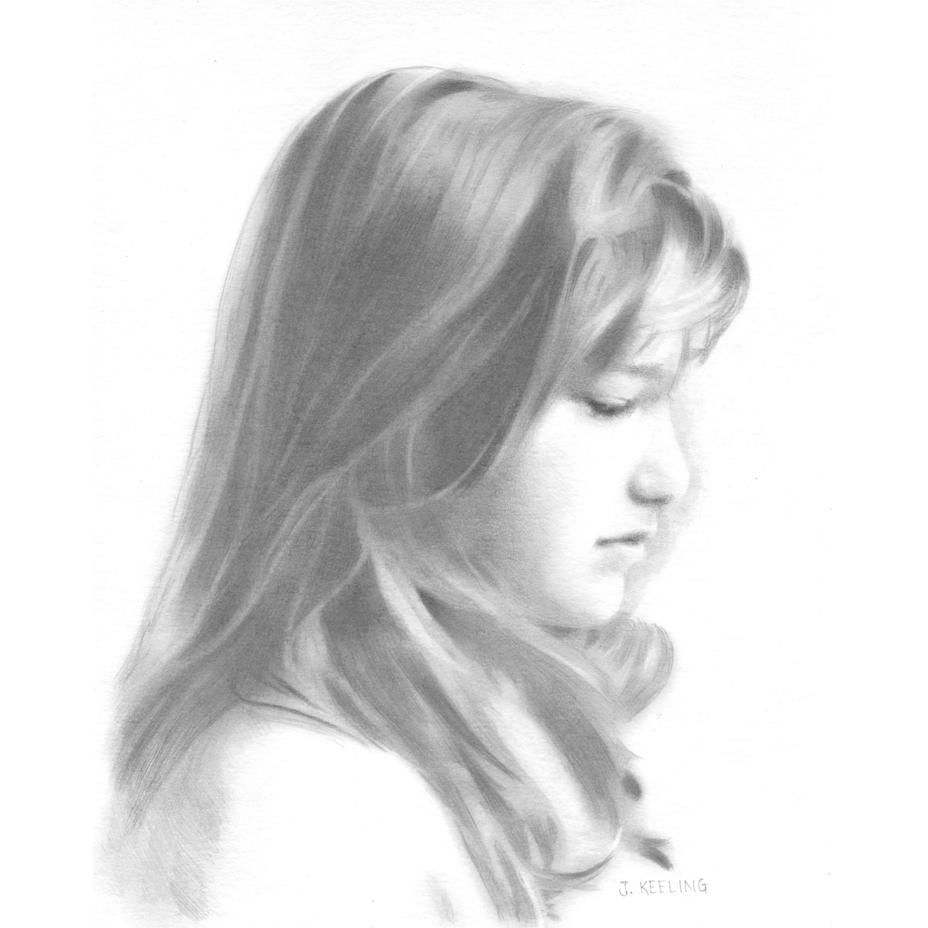
In 1989 my daughter’s dear friend Sarah went on a trip with us to St. Augustine. I cannot imagine how she sat still long enough for me to draw her from life!

Sarah in St. Augustine, graphite, 10x8 inches
IN OTHER NEWS
I was happy to hear the news that my painting Ice Dream Café was accepted into the 2024 Biennial Juried Exhibition put on by the Tennessee Watercolor Society. Because this is my third acceptance into a TnWS exhibition, I am now a Signature Member of the Society. I really like the heavy glass plaque they gave me. Hooray!

Dreams and Daimons in My Studio
I paint the good daimons!

I am considering a new direction for my work. I want to give my paintings dreamlike qualities and to include an animal in each painting. I think of each animal as a “daimon.” Don’t worry, the daimons I paint are good. They are not demons!
NEW WORK
The subject in Me and My Daimon has a dreamy look, and the surreal floral pattern runs unbroken from the wall across the subject’s clothing. I like how the presence of an animal in a painting, whether in a dream or not, communicates the idea of a relationship.
Daimons are benevolent supernatural beings. They originated in the thinking of the ancient Greeks, who positioned these spirits between humans and the divine. It wasn’t until the second half of the second century CE that some daimons began to acquire evil qualities, becoming demons.
There are several ways to spell the name of this animal spirit: daimōn, daemon, daimon… I chose daimon so I wouldn’t have to use a diacritical mark and because it makes me think of the word “diamond.” Nowadays the word daimon may be used to describe an inner guiding light.

Me and My Daimon, watercolor on Aquabord, 20x16 inches
Ice Dream Café is an ice cream shop floating in the sky, obviously as a dream. One of the surreal elements is the tessellation I painted across most of the images. A tessellation is a special design spread over a surface; it is made of flat geometric shapes that are arranged so there are no gapping or overlapping edges.
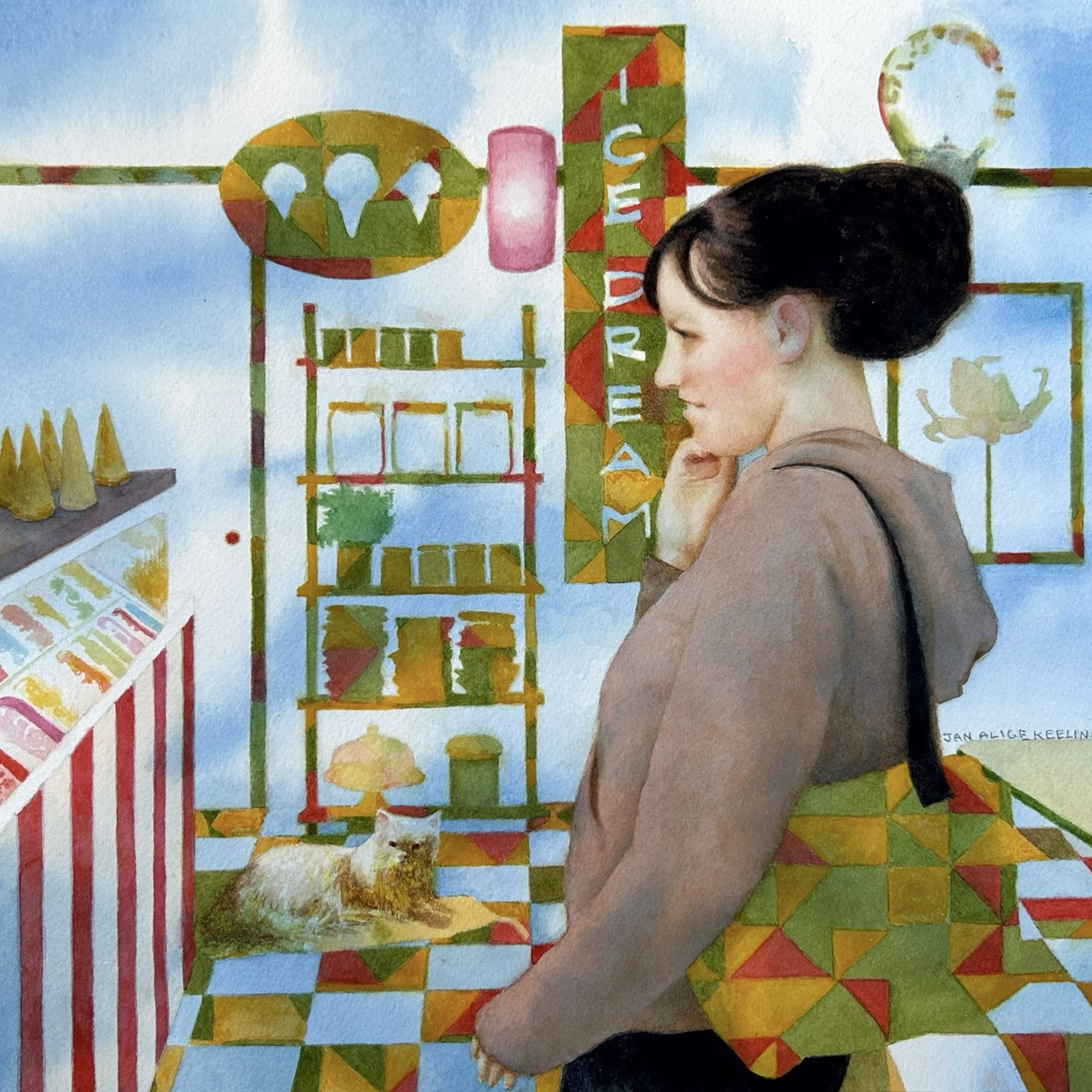
Ice Dream Café, watercolor, 12x12 inches

First three stages of Ice Dream Café
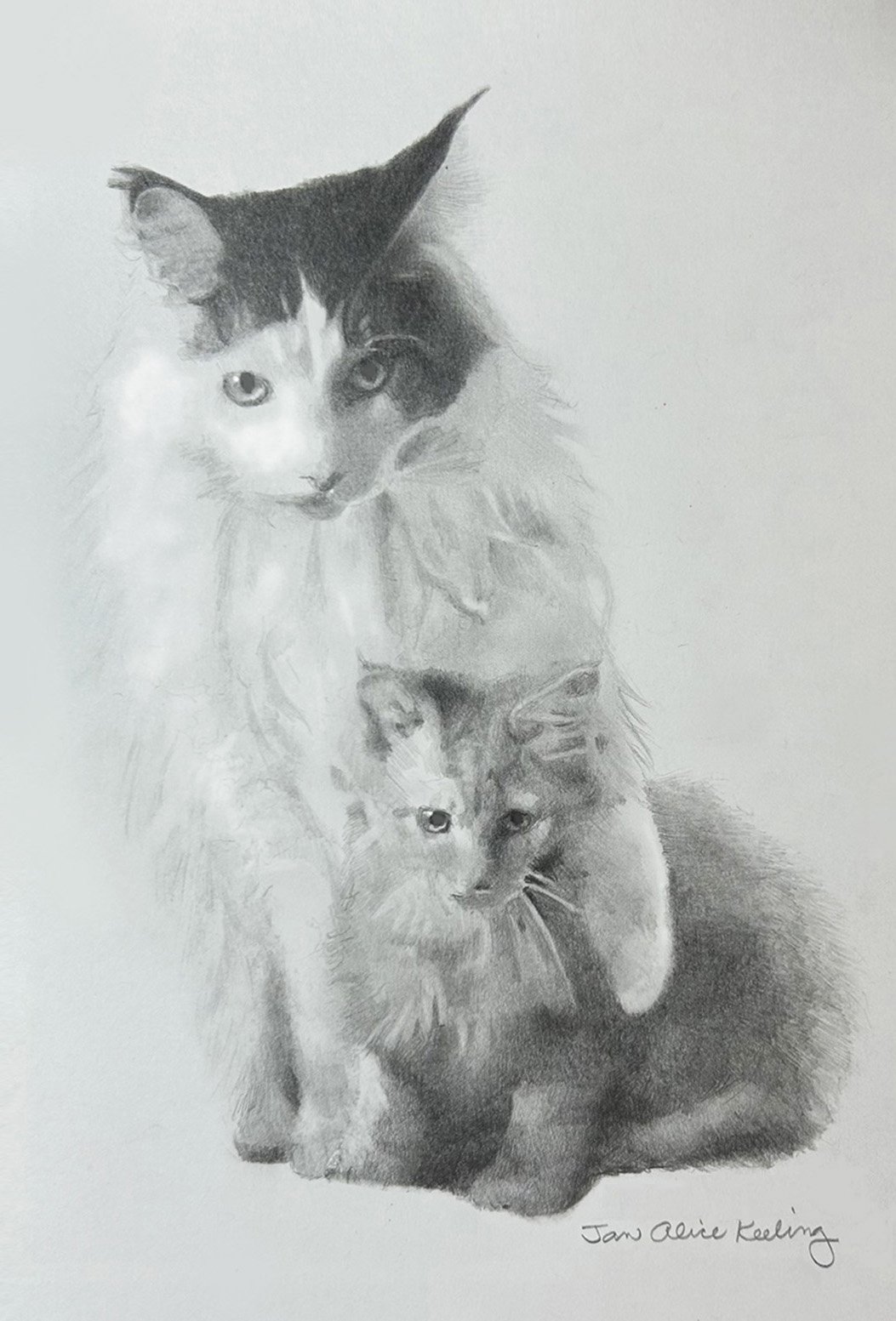
Ansel and Calli, graphite, 7x4.5 inches
I used this drawing of two of my sister’s cats on holiday cards in 2023.
Ansel is the larger cat protecting Calli, the kitten. They are both Maine Coon cats, who are affectionate and large-growing. If you could see them now, you would see Calli has grown as large as Ansel — eighteen pounds!
Not surprisingly, the Maine Coon cat originated in Maine, and it became the official state cat in 1985.
There is a myth that Maine Coon cats resulted from domestic cats breeding with raccoons. It is just a myth.
Relationship-Based Paintings and an Idea
Three paintings and an idea.
This month I offer you images of paintings based on relationships — one that grew out of a new/old friendship, one of a beloved cat, and one created for an exhibit that grew out of a relationship between the United States and Scotland!
❤ Love, Jan Alice
NEW WORK
Simba, watercolor on Arches, 10x8 inches
A Friendship That Was Meant to Be
Though Simba and I were close friends in high school, after we graduated, we didn’t see each other for fifty years! When we finally got together again, it felt as if we simply picked up where we left off. It was as if we had stopped in the middle of a conversation and resumed the conversation fifty years later.
This little painting is of Simba at the age of twenty-two.
Gordon
I learned recently that this little work was accepted into the Art Ability Annual Exhibition. The painting is of my son-in-law’s much-loved cat Gordon, who likes to hang out on their back deck. I was interested in painting the shadows, the glimpses of greenery between fence boards, and the black and white pattern of Gordon’s fur.

Cat on a Deck, watercolor on Aquabord, 9x12 inches
In Other News
2024 International Exchange Exhibition
(United States and Scotland)

Kelly, watercolor on Arches, 8x8 inches
In 2018, Scottish artists, all members of the Royal Scottish Society of Painters in Watercolour (RSW), displayed small works at the Gallery of the National Watercolor Society (NWS) in San Pedro, CA. It was meant to be an exchange program, but because of Covid, the reciprocal part of the arrangement (RSW displaying paintings by NWS members) had to be postponed.
It is now time for RSW to move forward. I was excited when my small watercolor painting Kelly was selected for the online portion of the RSW exhibition. The major requirement for this show was that each submitted painting had to be exactly 8x8 inches, no more, no less! The selected paintings will be posted online in January 2024. All online paintings will be available for purchase.
Bonus Idea for Artists
from LCLewis
Special Tip: Set aside a few moments to be open-minded and non-judgmental about your ideas for possible subjects for new art works. Foster a playful attitude and see if you can enjoy letting your mind drift and wander. For these brief minutes, the main purpose or goal is to hone your ability to detect an art element in an object that speaks deeply to you or resonates with you. Good ideas often arrive if you are purposely purposeless in your search for them!

Practice: Go through your living space or yard and collect several small objects. Select any object that catches your eye, from indoors or outdoors, until you have objects with different colors, shapes, functions, and textures. Do this quickly, without evaluating or second-guessing. Have a box or basket ready to place the items in, or just pile them together on a chair or bed.
Once you collect the objects and place them together, you can closely regard and “interrogate” each one. One by one, notice and experience each object. Let your imagination roam as you wonder about each object. Remember how the items feel when you touch them, as well as how they look.
Select one, and take it into a different context (in your mind). Look at/listen to the object—is it balanced? Does it tell a story? Can it talk to you? Is it beautiful? Is it flawed? Does it convey its purpose? Can it be used for other purposes?
When you've answered those silent questions and other questions you will think of on your own, you are ready to sketch a first draft of a study presenting the object in a new way or in a new context, possibly surrounded or accompanied by some of the other objects found in your search. If you like, you can develop this study into a finished drawing, painting, or other work of art.
Last Year’s Holiday Card
Remember to Sign Up for My
2023 Holiday Card!
If you would like to receive a real holiday card from me (not digital!), be sure I have your physical address. Please email your physical address to ja@janalicekeeling.com with “Holiday Card” in the subject line.
Two New Works on Aquabord
A watercolor substrate that does not require glass.
One day I may give up paper surfaces completely! I am painting more and more of my watercolors on a special clay surface called Aquabord™. When you use Aquabord, there is no need to use a mat and glass when framing. The surface remains beautiful, without the reflections caused by glass.
If you are interested in commissioning a portrait in watercolor but have put it off because of the hassle and expense of framing, you may want to request the use of Aquabord instead of traditional paper. Similar to an oil painting, a watercolor on Aquabord requires only a simple frame. Some people even ask for a “cradled” Aquabord surface, which does not require framing at all!
NEW WORK
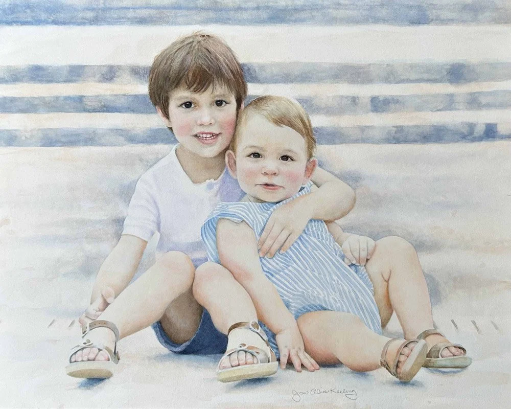
I recently completed this portrait of two young brothers. The reference for the painting was an amazing photograph by photographer Katie Mosley (k. mosley photography), who found a way to capture the boys in a rare still moment!

Burton and James, watercolor on Aquabord, 16x20 inches
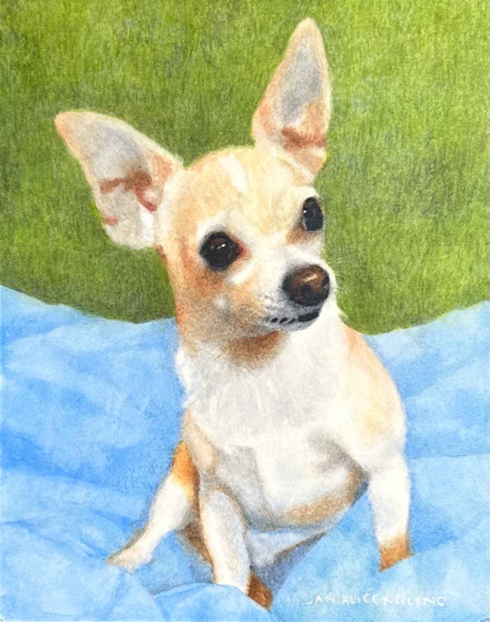
Tater, watercolor on cradled Aquabord, 10x8 inches
Tater is an adorable chihuahua rescued by dear friends. Though he weighs only six pounds, Tater is a plucky little fellow. He was found running around on the busy streets of East Nashville by Bonaparte’s Retreat! The painting is based on a photo taken by Ernie Boyd.
IN OTHER NEWS

Business card front
It’s time to order new business cards! I kept the original format by Kate Cunningham Design, with information on the front and my art on the back. Below are the ten new backs!


Business card backs
BONUS IDEA FOR ARTISTS
from LCLewis
Special Tip for Boosting Your Creativity: If you paint with music playing in the background in your studio or work area, find an unfamiliar kind of music to listen to. Instead of playing a familiar genre you enjoy, search online for music in another style or from a different region.

Roxy and Harry, watercolor, 10x8 inches
A few genres to choose from:
Classical music (piano, symphony, opera)
Easy listening (ballads, movie themes, popular music)
Broadway tunes
Jazz
Country music
If you like to listen to music with vocals, find and listen to songs in a language you do not understand. Observe what the music is doing. Imagine what the story might be.
And if you do not usually paint with any music playing, then set aside a painting period or two during which you will paint accompanied by music of whatever genre you enjoy, or select an unfamiliar style and language as described above. Use your enjoyment of what you’re hearing to inform your feelings and vision as you plan and paint.
MARCUS SMART IN WATERCOLOR
2022 Defensive Player of the Year!
I recently completed the watercolor Marcus, requested by my daughter Kelly. Kelly is a huge fan of Marcus Smart, elite point guard for the Boston Celtics and reigning Defensive Player of the Year. Male relatives and friends have responded to this portrait with more enthusiasm than for any other portrait I have painted!

Marcus, 9x9 inches, watercolor

Steps 1, 2, and 3 for Marcus
Note: The Marcus painting is based on an AP/Sports Feed photo posted online; permission pending.
Pet Portrait in Pencil: Jake
How could you resist that face?
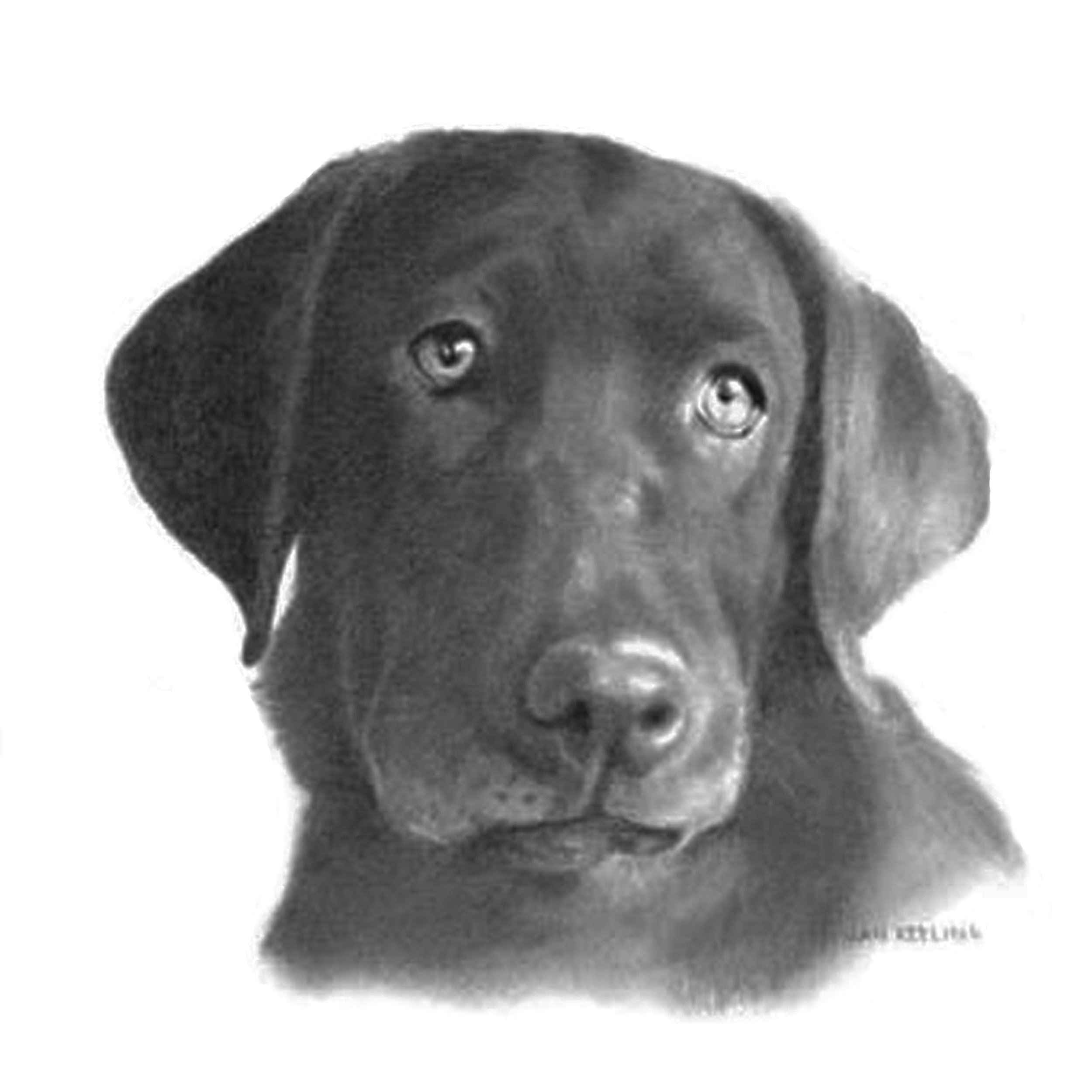
A dear friend commissioned this graphite portrait of a chocolate lab. She made a gift of it to her nephew, the dog’s owner.

Jake, graphite on paper, 8x8 inches
Very Basic Supplies for drawing in graphite
Many traditional graphite artists insist on drawing with wooden pencils sharpened with razors and sandpaper. Such sharpening is an ongoing process that I choose not to engage in. Why? Because life is too short. I discovered that mechanical pencils in a range of grades produce effects that please me, without the time required to keep them sharp.
3 or 4 (.5mm) Pentel Mechanical Pencils
Pentel Lead Refills in three sizes, 2B, HB, and 2H.
Any good drawing paper. Carol Rosinski on Carol’s Drawing Blog offers reviews of some good choices.
Kneaded eraser
Before beginning a drawing, play with the different sizes of pencils, shading in parallel strokes, crosshatching, drawing lines both firm and delicate.
You may eventually wish to get other supplies, straightedges, blending stumps, other lead grades. Pentel Lead 2B can build up to a pretty dark value, but to get even darker, you may wish to use a 6B pencil. I used to use a lot of blending in my graphite drawings, but I now prefer to use the very hard 2H grade lead pencil to “blend” with light parallel and crosshatching lines.
PORTRAIT: ANNAPURNA
A portrait surprise…
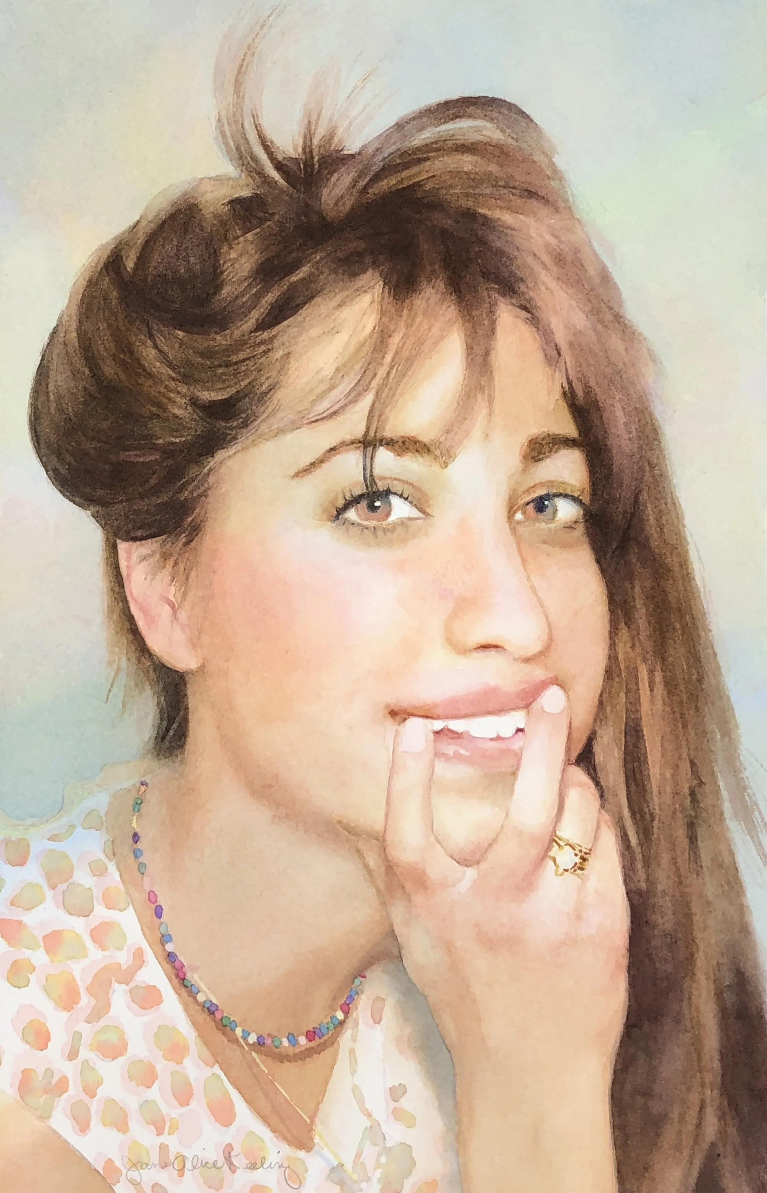
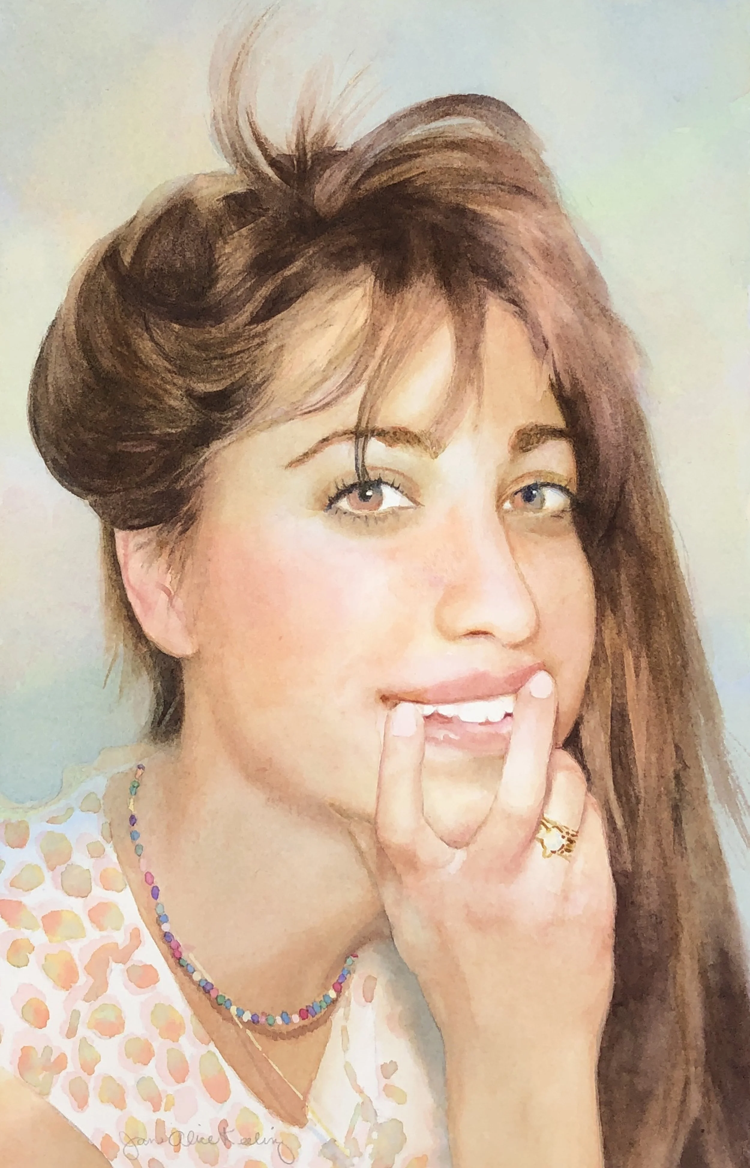
Annapurna, watercolor, 14x9 inches
Annapurna was a surprise for my beloved neurologist, who has successfully treated my multiple sclerosis for thirty years. As an expression of my gratitude, I told him I wanted to paint a watercolor for him. I asked him what he would like me to paint, and he said: “My daughter.”
His daughter happens to be Annapurna Sriram, an award-winning actor, writer, and director who plays the lead in the film Feral, which can be seen on Amazon Prime.
Annapurna sent me several photographs from which to choose a reference. We narrowed it down to two photos, and I asked which one she liked best. She thought one of the photos was better artistically, but she thought her father would prefer this photo because it “shows more life.” Of course this is the one I painted.
Because I finished the painting in the time of Covid, I showed it to Dr. Sriram during an online appointment with him. If I’m not mistaken, I saw moisture come to his eyes.

Photo reference
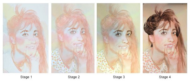
Stages of the painting process
interview: Member Spotlight
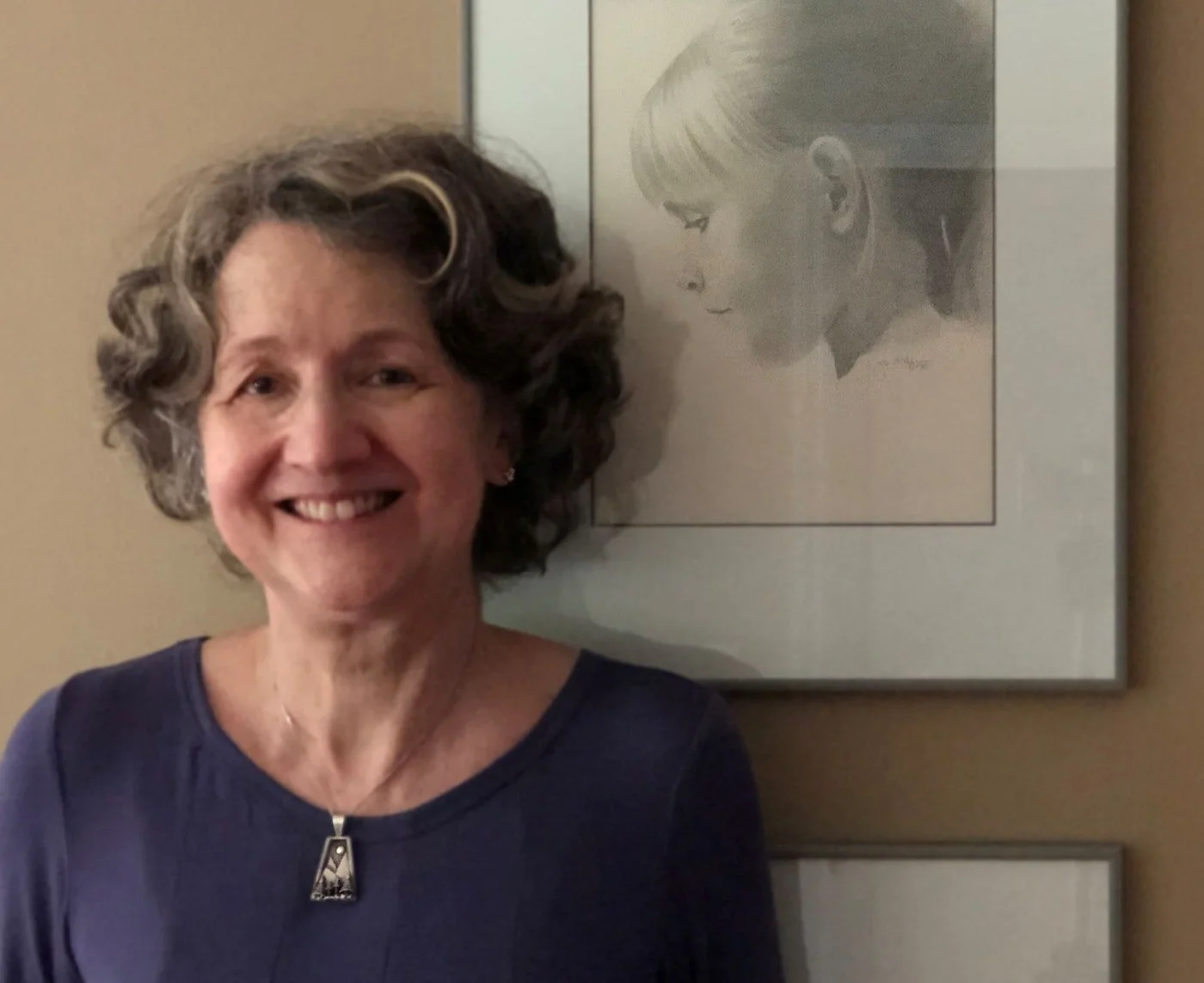
I am interviewed by Kristen O’Neill from Art Biz Success.
I was a member of a community of artists dedicated to growing their businesses and making an impact. It all began when we signed up for an art business program created by Alyson Stanfield of Art Biz Success. I was featured in a Member Spotlight interview in 2021:
Why is it important to you that your art business is profitable?

It is important to me that I pay for my own art supplies, exhibition entry fees, and workshops. It is good for my sense of well-being to know that my art career is self-supporting.
Mind you, my models did not charge for posing for me. I used many of the photographs I took of my two daughters as references for paintings and drawings, and I still do. I have hundreds of photographs from the last forty years that can serve as references.

Daughters, oil on panel, 12x16”
Sometimes the girls sat as still as they could while I drew them from life. I sold many of the paintings, not those that were specifically portraits of my daughters, but those that might remind a viewer of another girl or woman.
What has your attention in the studio these days?

Roxy and Harry, watercolor, 10x8”
I am excited about raising the quality of my watercolor paintings. I have reached the time in my life when I can afford to put more hours into painting, and it’s true what they say: The key to improving your skills is to practice! I am enjoying painting in layers of watercolor, becoming more skilled at softening edges, and not going too dark too soon. I am also very excited about continuing to organize my studio. I have made a lot of progress, and there’s much more to do. I still need to get rid of things that do not “spark joy” (thank you, Marie Kondo).
What lesson in Art Career Success System do you find yourself returning to?

Nick and Sara, watercolor, 16x12”
Magnetic You has been important to me. I was glad to learn how to use the freewriting challenges to start work on statements, bios, and all the other writing that supports an art career. I gained confidence from working through the MY modules, and I began to think: “I can do this.”
How to Become Nashville's "Artist of the Week"
See your art on the Nashville Sign!
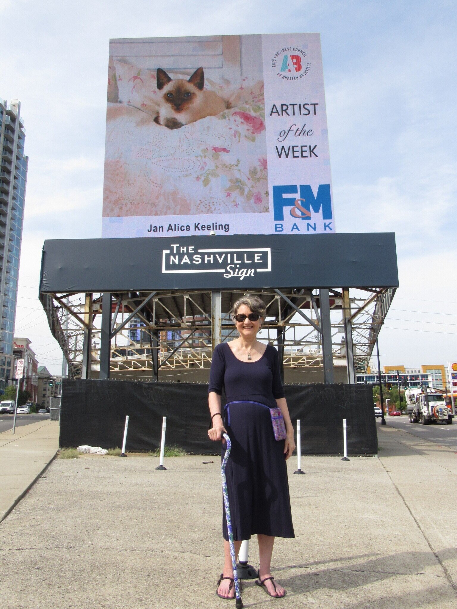
I was jubilant when I received an email from the Director of Programs at the Arts & Business Council of Greater Nashville telling me that I had been chosen as “Artist of the Week,” and three of my paintings would be shown on The Nashville Sign. If you happened to be driving west on Broadway toward West End from August 30 through September 5, you might have seen one of my paintings pop up on the sign. You would have had to look fast, because each image was displayed for eight seconds and rotated with many sports and country music images!
My husband and I went out to the Nashville Sign on the evening of September 4, and Hank “filmed” me in front of the sign. If the video seems to be blocked, you can click on the YouTube button and it should play.
How Does One Become “Artist of the Week”?
“Artist of the Week” is a program sponsored by the Arts & Business Council, Blackbird Media, and F&M Bank. The Arts & Business Council features “Artist of the Week” on their website, in their newsletter, and on other social media, and it can be seen on The Nashville Sign’s social media channels.
Wolfie and me
So how does one become an “Artist of the Week”? Well, the Arts & Business Council is currently taking a hiatus from the program. We will be notified when they resume the program. But you still might want to sign up for membership in the Arts & Business Council of Greater Nashville. It’s only $30, and membership offers so much more than a chance to become Artist of the Week: monthly seminars on mastering the business of art, an artist entrepreneur training program, pro bono legal and business services, and many programs and services designed to stimulate a flourishing creative culture in Nashville.

Ansel and me

My photographers
Two Kittens
A couple of step-by-steps for kitten paintings.
“Cats have a mysterious magnetism, and watercolor is uniquely suited for painting them. I like to picture the translucent gaze that reflects a cat’s personality, sometimes confident, sometimes stealthy. Reproducing a furry coat on a hard surface with water, pigments, and a brush is a challenge during which I hold my breath until the task is done. My objective is to suggest the singular features appreciated by lovers of cats: striking beauty, cozy fur, a vibrating purr, the hint of menace behind crystalline eyes.”

Cat in a Beret, 8 x 10 inches, watercolor
Below are the stages of the watercolor of our friends’ Siamese cat, with his cool personality:

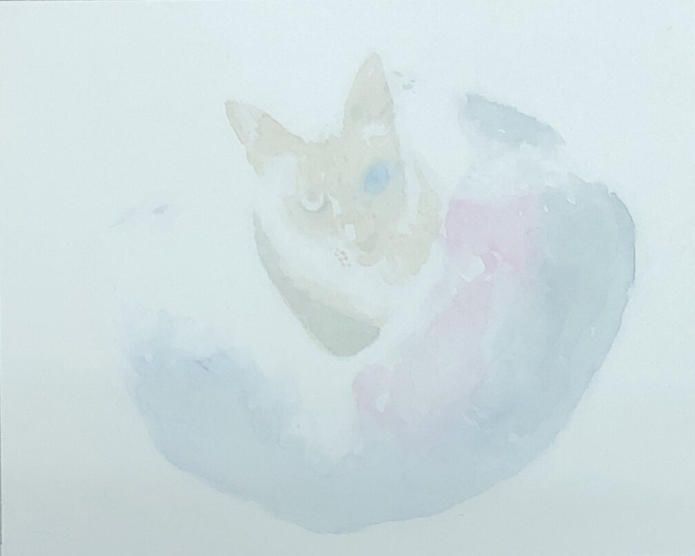


Stage1: I begin painting with Daniel Smith’s Phthalo Blue (RS) dulled a bit with DS Quinacridone Burnt Orange.
Stage 2: I add more Burnt Orange to the original mixture and begin painting the cat. I add a bit of DS Quinacridone Rose to the beret.
Stage 3: I continue to add more color.
Stage 4: I add more detail and more darks. For the final painting, I will work on refining the painting and adding more depth.

Feathers and Kitten, 10x8 inches, watercolor
And below are the stages of the watercolor of my sister’s Maine Coon Cat, a kitten called Ansel:
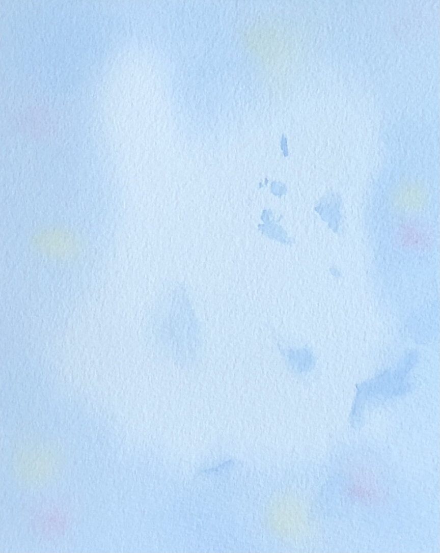
Stage 1: I float a soft layer of Daniel Smith’s Phthalo Blue (Red Shade) and Quinacridone Rose, plus M. Graham’s Quinacridone Gold onto the background, then add a few more touches of blue where I know there will be darks.

Stage 2: Using the same colors, I begin to add some details.
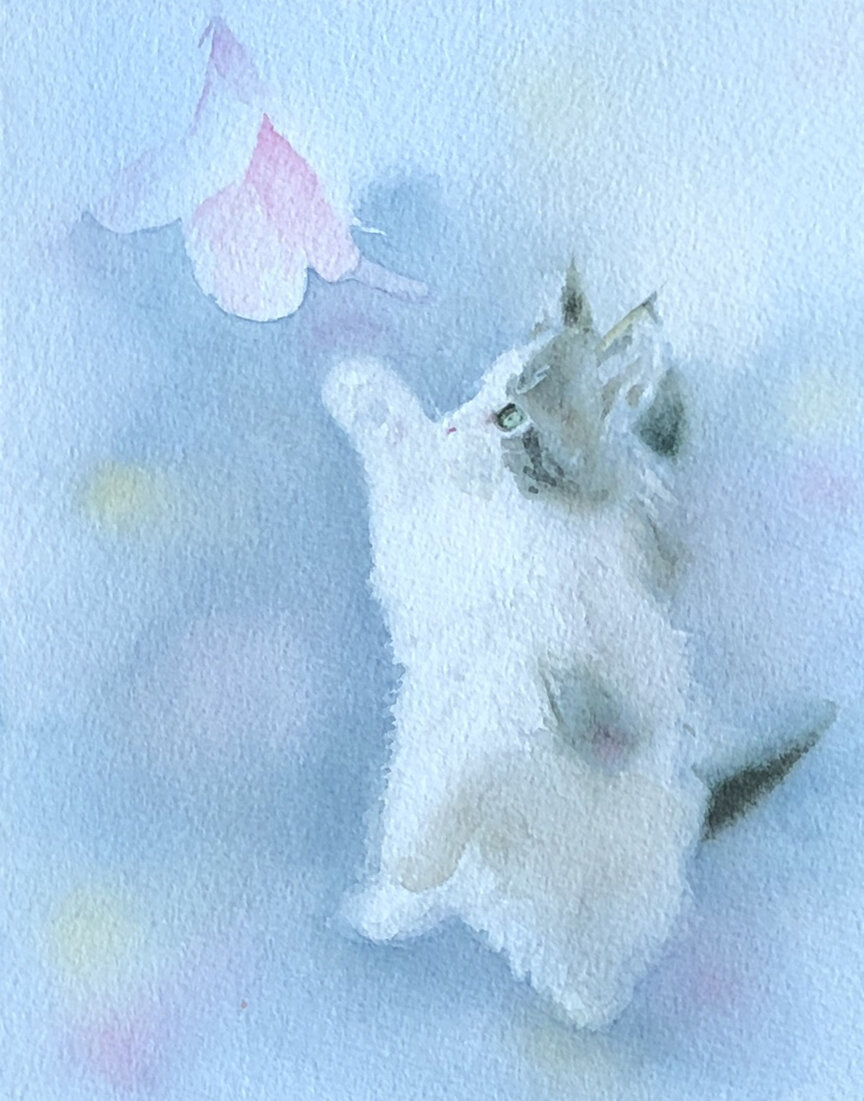
Stage 3: I begin to paint the darks. Black is Phthalo Blue mixed with Daniel Smith’s Quinacridone Burnt Orange.

Stage 4: More darks.
A lesson from Janine Helton: negative painting
Find the teacher who is right for you.
Most of the time I want to use what I learned from oil painting in watercolor painting, to build form with shadows and light. But sometimes I want my work to be juicier, more obviously a watercolor. I wanted to learn how to paint with colors joyous and pure, applying water and color without testing everything first. I surfed the web, looking for an artist I thought I could learn from. I had three requirements. I was looking for an artist:
whose style was fresh and “watercolory”;
who knew how to paint people;
who gave online classes.

Puffed Up Chickadee by Janine Helton
At last I found this artist: Janine Helton, who lives in St. Louis, Missouri. Take a look at her website, and you’ll see she obviously loves birds—her paintings of birds are tender and beautiful. When one views her wonderful portraits, it is obvious that she also loves human faces.
I began by taking a couple of classes from Janine, Negative Painting for Watercolorists. Most artists know that “negative painting” is what you do when you don’t think that painting a form itself will have the best results. For example, it often works better to paint the space around a vase or a flower than to paint the vase or flower itself. But there is much more than this concept to Janine’s negative painting approach.

Aging Rose, negatively painted by Jan Alice Keeling
She often uses Strathmore Aquarius II Watercolor Paper, an inexpensive lightweight paper whose beauty is that it lies flat, without taping, even when you use watery paint. She begins by wetting the paper on both sides, and she may float and spatter some color on the front side to make an interesting underpainting.
After this first layer is dry comes the unusual part. You find the shape in the group of flowers or foliage that looks closest to you, and you paint around that shape, feathering the edges of the wash so a line remains only around that first shape. After drying, you add another shape or shapes by sketching or tracing, and paint around those shapes with a darker color. What is different about this approach is that you are not using shadows to create form! The results can be quite lovely.
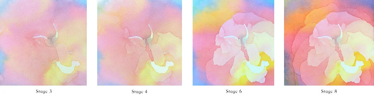
Some of the layers painted for Aging Rose
I love the round, pointy brushes Janine recommends for negative painting: Loew-Cornell 7020 Ultra Round. They hold a LOT of water and have an amazing sharp point. They are synthetic, therefore inexpensive, so you won’t feel guilty if you scrub an area with the point.

Loew-Cornell 7020 Ultra Round Brush
I learned so much more from Janine, from the Negative Painting classes as well as from her Bird and Portrait classes. I’m sure I will mention Janine and her wonderful approaches to painting in future posts.
My latest palette now consists of colors that are based on Janine’s palette of colors. I am thrilled with the selection. I will write more about my new palette later.
Making the Most of Your Online Art: An Expert’s Advice
Not every online offer is a scam.
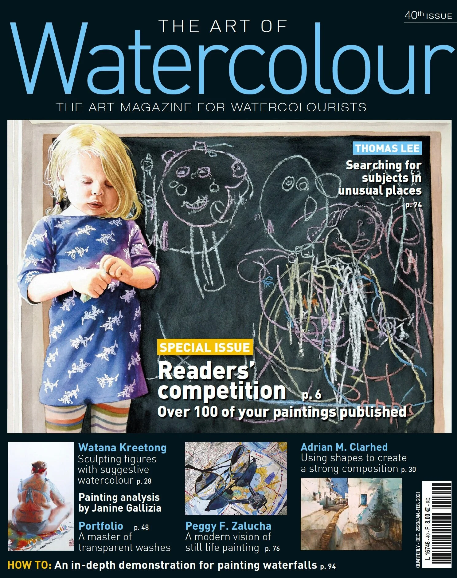
Cover of 40th issue of The Art of Watercolour
The Facebook message read: ”My name is Laurent Benoist and I am a journalist for The Art of Watercolour magazine. I’m contacting you because we would very much like to run an article on your paintings in the next issue.”
When I received the message, I thought: Can this be real? We artists often hear warnings about scammers who contact us online with schemes designed to extract money from us. Many of us have received such fraudulent offers. But, as I discovered, not all out-of-the-blue offers are scams.
After the article was published, I contacted Laurent Benoist. I wanted to know what he looks for when searching for an artist to cover in the magazine, so I could tell my artist friends. He told me: “We have several ways of finding artists for our magazines: social media, especially Facebook and Instagram; artists’ and galleries’ websites; word of mouth, such as one artist mentioning another as a source of inspiration; and exhibitions, of course. Due to travel restrictions and most exhibitions being canceled, I relied more than ever on social media and the internet in 2020.

Pages 70 -71, The Art of Watercolour, 40th issue
“Social media and websites are, in my opinion, complementary,” he continued. “Facebook and Instagram are good for discovering new artists. And because some artists may have only one or two ‘good paintings,’ I look at a website to make sure the artist has a relevant and interesting body of work. I actually find websites to be more useful when choosing artists for a magazine, as the paintings are more often than not sorted out according to year of production, technique, subject, and so on—although there are some artists who can be rigorous in the way they present their work on Facebook!”
“Finally, I always find it very interesting when an artist has a blog, as it means he or she is articulate about their approach to painting (which is not to say that artists who do not share their thoughts on the Internet are less articulate). I usually do not use the exact blog content, but it can inspire me to ask questions that the artist will find relevant, and if the artist’s answers are too short, the article can always be enriched with info from the blog.”
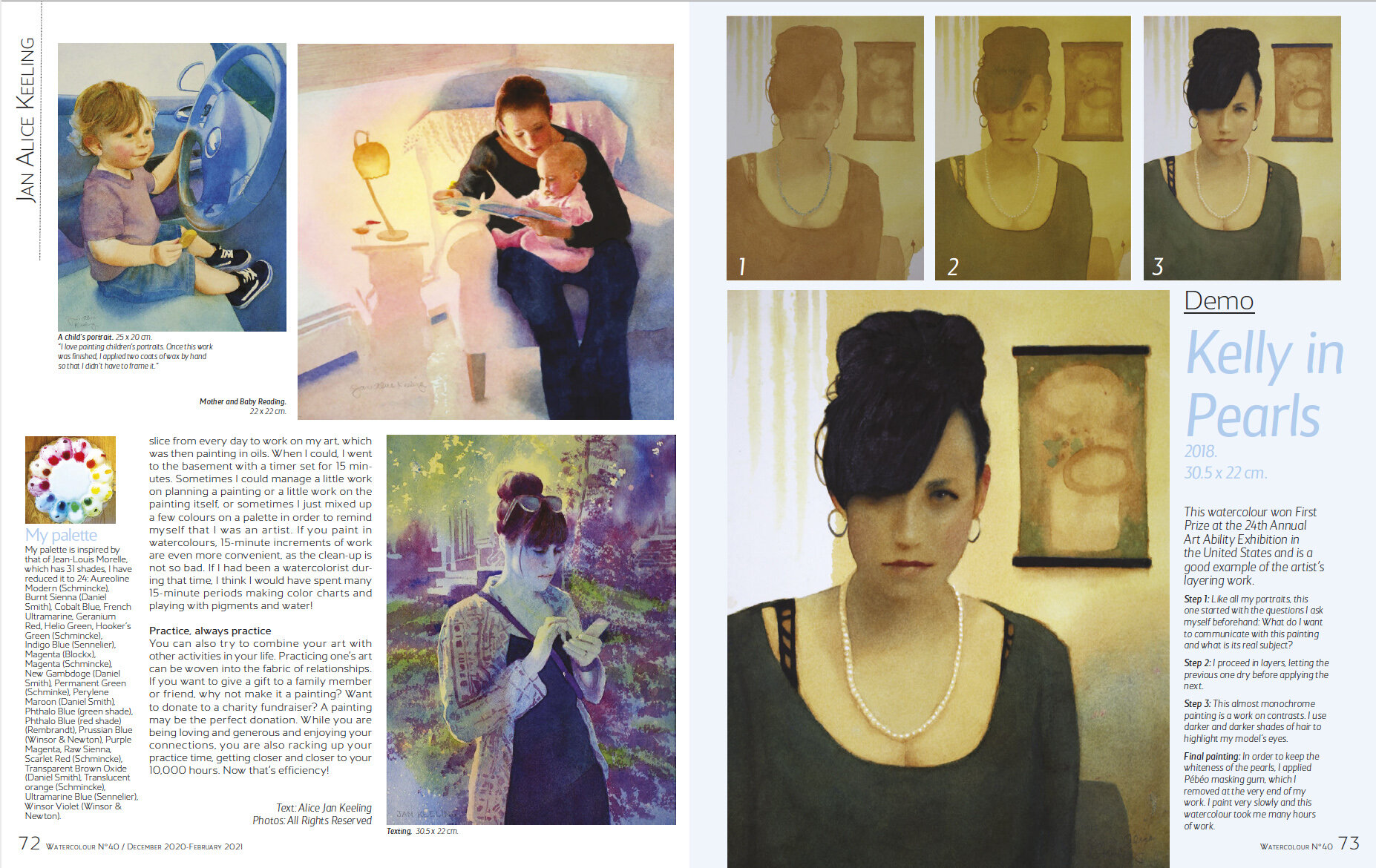
Pages 72 -73, The Art of Watercolour, 40th issue
Benoist added: “Another piece of advice: Recent smartphones take great pictures (better quality than digital cameras from ten years ago), so much so that they can be published in paper magazines. Pictures are best taken outdoors with overcast weather (i.e., no shadows from sunlight).”
An Artist’s Online Checklist
Keep your website, Instagram, Facebook page, and other social media up-to-date.
Post good-quality photos of your artwork.
Make sure you display a large number of high-quality paintings, with the best ones front and center.
Present your paintings in an organized way, divided by year of production, medium, subject, or some other way.
If you like to blog, blog!
Final Cautions
Should you get an online offer from a journal or other publication, do some research to make sure the publication is legit and the journalist is on the masthead. Never, ever send money to someone as a condition of being published, exhibited, or purchased.
Follow these cautions and you are less likely to have a terrible experience and more likely to have a delightful experience like the one I had!
That Face
Did I go too far?
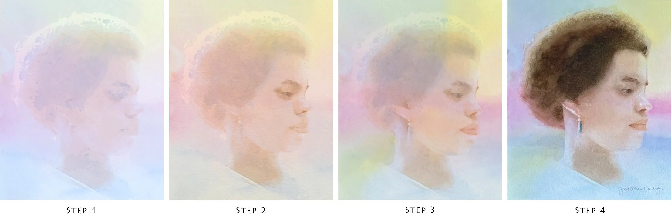
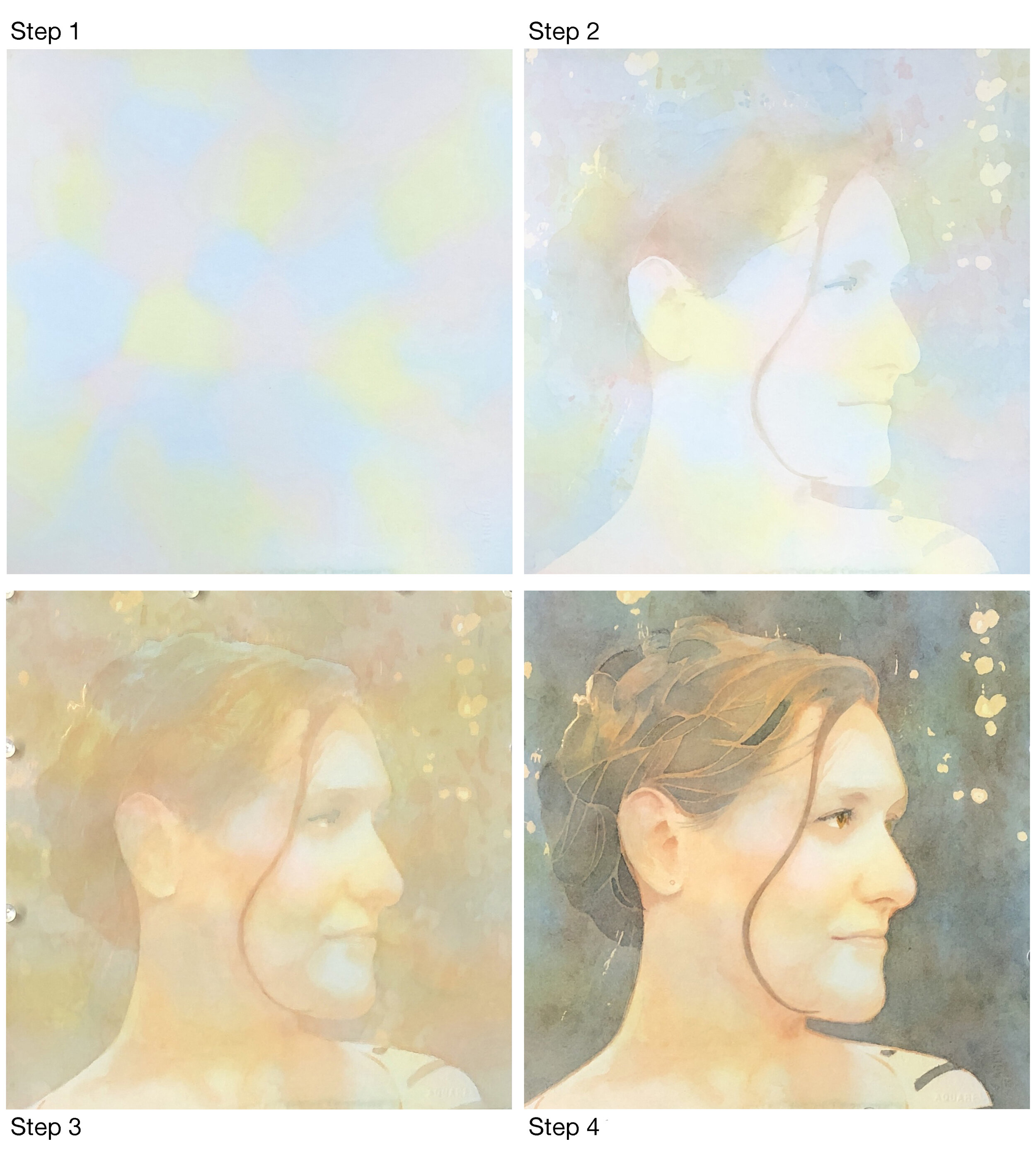
Here is my latest watercolor, 11x11 inches, to be entered in the Tennessee Watercolor Society 2021 Juried Online Exhibition.
You’ll find 4 Step-by-Step images below the main image. Looking at those images makes me wonder if I went too far on (or “overworked”) the painting. Should I have stopped a little earlier on the face? Did I stop too early on the hair? What do you think?

THAT FACE, watercolor, 11x11 inches
Art and the Ten-thousand-hour Rule
Talent alone is not enough.
“As practice makes perfect, I cannot but make progress; each drawing one makes, each study one paints, is a step forward.”

Most people would agree that it is necessary to have some talent in order to become exceptionally good at something. But talent alone, writes Malcolm Gladwell in his best-selling book The Outliers, is never enough, not if your field is complex. It is also necessary to devote a great deal of time to the practice of your art or science or craft or game. Talk of the “Ten-thousand-hour Rule” became common as a result of the popularity of The Outliers, though it was often misunderstood (see ”Complexity and the Ten-thousand-hour Rule” by Gladwell).
Now that my children are grown, improving my watercolor skills is my principal goal. The challenge and complexity of watercolor is so exciting to me that I sometimes wish I had been able to practice it many more hours in my life. But I shall be optimistic: I have many more practice hours ahead of me!
As Gladwell points out, having enough hours to practice often has to do with luck. I am fortunate to have a supportive husband with whom I have made an excellent bargain. My side of the bargain includes cooking dinner for him every night. He does the dishes, the grocery shopping, most financial tasks, and many, many other tasks. I take care of the upstairs, he takes care of the downstairs. He takes care of the yard and the cars … maybe I should stop before you start wondering what he is getting out of the marriage! (Remember the dinners?) My point is that I am a lucky woman, and having such a husband, who is filled with humor and kindness as well as diligence, allows me to spend as much time as I would like to on painting.
But what if you don’t have such great good fortune, at least not yet? Fifteen minutes at a time can get you started. When I was working full-time and had two wonderful teenagers in our small house and no room for a studio, I set up an easel in the basement and used the washing machine as a taboret. I tried to carve a little fifteen-minute slice from every day to work on my art, which was then painting in oils. When I could, I went to the basement with a timer set for 15 minutes. Sometimes I could manage a little work on planning a painting or a little work on the painting itself, or sometimes I just mixed up a few colors on a palette in order to remind myself that I was an artist. If you paint in watercolors, 15-minute increments of work are even more convenient, as the cleanup is not so bad. If I had been a watercolorist during that time, I think I would have spent many 15-minute periods making color charts and playing with pigment and water!

Of the paintings I have donated to fundraisers, cat paintings are always the most popular!
You can also try to combine your art with other activities in your life. Practicing one’s art can be woven into the fabric of relationships. If you want to give a gift to a family member or friend, why not make it a painting? Want to donate to a charity fundraiser? A painting may be the perfect donation. While you are being loving and generous and enjoying your connections, you are also racking up your practice time, getting closer and closer to your 10,000 hours. Now that’s efficiency!
Kimber & Owen: About the Painting
Decisions, colors used, and stages of the painting.
Two beloved beings. Owen’s grandmother commissioned me to paint them.

KIMBER & OWEN, 10X8 INCHES, WATERCOLOR
I begin the portrait as I begin all portraits, by asking myself questions.
What do I want to communicate?
I want to communicate Owen’s joy and the charm in both boy and dog.
Owen’s clear beautiful skin and flaxen hair must be painted well in order to communicate his youth.
What is the painting about?
It’s about the faces!
It’s predominantly about Owen’s face, but Kimber’s adorable quizzical expression is important as well.
Should I alter anything in the reference photo?
The dog in the background is not needed. Photoshop Elements to the rescue!
I used PSE to reduce the size of the boy’s gloved hand, which looked too large due to lens distortion.
The pose: the boy’s arms around the dog makes a great pose, looks natural and affectionate, and does not need to be altered in the least.

ORIGINAL PHOTOGRAPH ON LEFT, ALTERED PHOTOGRAPH ON RIGHT
Here are the colors I will use:


I draw the figures and paint a faint wash of blue over the parts of the painting that are not bright.
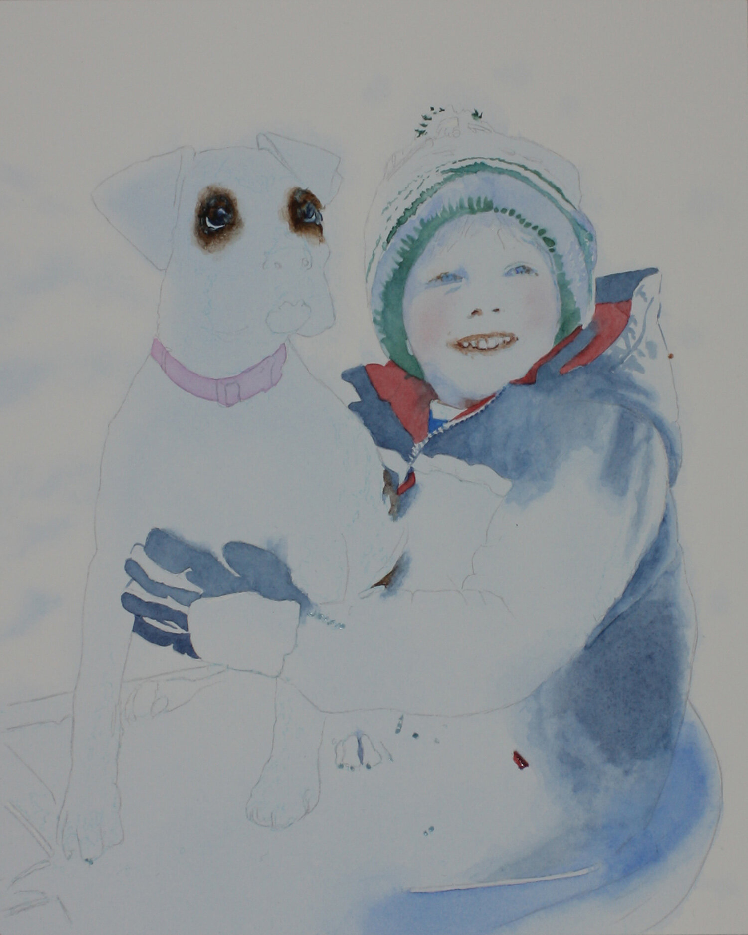
2. I rough in the eyes, then begin to apply color all over the painting.

3. I change my mind about painting all over, and determine to paint the faces first. I want the most important part (the boy’s face) and the second most important part (the dog’s face) to be correct before putting a lot of time and effort into the rest of the painting. This probably goes against somebody’s rule, but I care not.

4. NOW it’s time to apply paint all over the painting.

5. It’s time to think about showing the painting to Owen’s grandmother. I hope she likes it.
Why I Use Photoshop Elements Instead of Photoshop
How Photoshop Elements can be useful in the world of art.
In 2009 I wanted to enter a painting of a cat in an online show, but I discovered my image of the painting had a white dot beside one of the cat’s ears and a whitish area above the other ear. The painting was no longer in my possession, so I could not retake the photograph. I was interested in the wonders of Photoshop, but the price was out of my budget, so instead I got a free trial of the less expensive Photoshop Elements to see if it would meet my needs.

Before

After
And it did. Photoshop Elements (PSE) was simpler than Photoshop, easier to use, much less expensive, and it could do everything I ever wanted photo-editing software to do. These are some of the ways I use it now:
1. Alter photographs to make references for paintings.
This is my most common use of PSE. I combine photographs to make them into something I want to paint, or within a photograph I will alter colors and sizes and positions of objects. Of course there is no need to get PSE if you are perfectly happy using sketches and cut paper and your own imagination when planning a painting—unless there is a bit of a geek in your nature and you just want to try it!
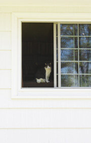
Original photograph

Altered to make reference for square painting, cat enlarged, windowframe completed
2. Alter photographs of finished art when the photograph does not match the art.
Don’t get me wrong! The point of using PSE on a photo of a painting is not to fool people in thinking the painting is better than it actually is. But there’s no harm in using it on a photo that does not match the original art, especially when entering a show. These are the kinds of things you can alter:

Before

Color corrected
the color or brightness of the photo does not match the color or brightness of the original art
there is a mark on the photo that is not on the original art (the “Bandaid” tool can work wonders!)
the photo corners are not properly squared (try the “Skew” tool)
3. Crop and size painting images for entering a show.
Please do not buy PSE if sizing images will be your only use for it! If you have a Mac, the built-in app Preview is excellent for sizing images, and there is other software for sizing images that you can download from the Internet. But if you already own PSE or are buying it because you will have other uses for it, it can be used for sizing images as well.
The full Photoshop is advertised as being more affordable than it used to be, but “affordable” means it comes with a subscription. After you buy Elements, you will truly own it, and you can use it for a very long time.
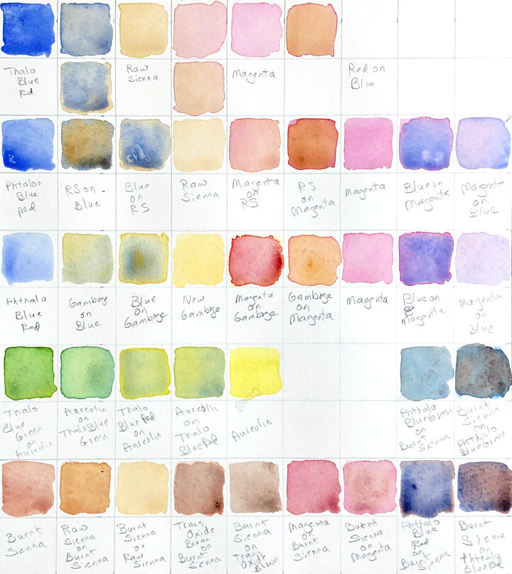
My Palette
An introduction to my favorite porcelain palette, and twenty-four colors.
I use a Jack Richeson Porcelain Palette designed by Stephen Quiller. I love it because it has twenty-four main wells, exactly the number of colors I have chosen for my collection. It also has eight corner wells, which I use for white and blacks. The palette design is beautiful, and what could be better than pure white porcelain for watercolor painting? I do not use the Quiller Color Wheel, even though it was created by the same clever man who designed the palette.
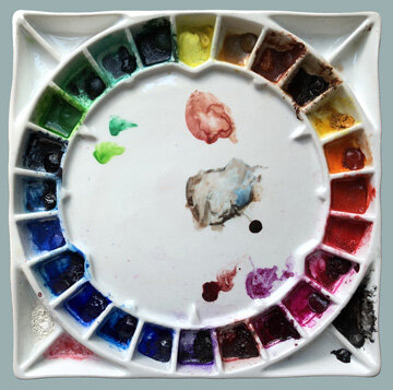
Jack Richeson/Stephen Quiller Palette
Instead, I use a modified version of the color system in the book Watercolour Painting: A Complete Guide to Techniques and Materials by Jean-Louis Morelle. His 31-color palette is set up in the shape of a triangle. This setup is intended to communicate Morelle’s ideas, not to suggest that you should buy an actual triangle-shaped palette. (Okay, I did try to find one!)
If you want a more limited palette (and who doesn’t!), you can use Morelle’s ideas to set up palettes with fewer numbers of colors. As stated above, twenty-four is my perfect number, enough separate pigments to keep mixing to a minimum, but not so many that the process of selecting colors gets out of hand. Here is my list of twenty-four colors, including the brands I currently use.

So which of Morelle’s ideas did I use to come up with this list of colors? And how did I arrange them on my round palette? Those questions will be answered in a future post.